Form Builder
MetahOS gives the users unique ability to build their own forms, the types of documents that you can create on Form Builder are
Care Plans/Protocols Assessments Admission Forms Discharge Summaries Consents Counselling Education Handoffs Checklists Letters
Based on the access that provided to you, you will see the options from which you can create any of these forms.
Creating a Form
The followin example shows how to build a care plan, the same can be applied for the rest of the document types mentioned above.
The validation for each field can be configured, you can change the control from a drop down to a check-box with a click of a button and also put control over the type of data that is keyed’ in. ### Fields/Controls There are various controls that are available and more get’s added periodically, you can also request for smart controls and special fields via our support site support.m16labs.com
Fields
Common Properties
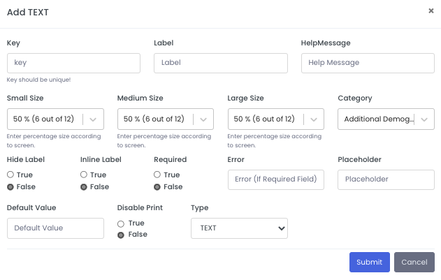
- Key: Unique identifier of that particular field.
- Label: A label for the input box.
- Help Message: This would be shown below the Text Input field as Hint.
- Small Size: Size of that field in Screen of screen size less than 768px
- Medium Size: Size of that field in Screen of screen size less than 997px and greater than or equal to 768px.
- Large Size: Size of that field in Screen of screen size greater than or equal to 997px.
- Category: Assign a Category for analytics purpose.
- Hide Label: Can be True or False, Hides label of that field if true.
- Inline Label: Can be True or False, Align Label and Field horizontally if true.
- Required: Makes field mandatory.
- Error: Text to be shown when invalid input.
- Placeholder: Text to be shown when field is empty.
- Default Value: Initial Value
- Disable Print: Can be True or False, Avoid this field from printing.
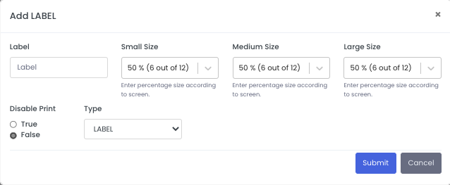
LABEL
labels are simple texts.
Propertites:
- Small Size: Size of that field in Screen of screen size less than 768px
- Medium Size: Size of that field in Screen of screen size less than 997px and greater than or equal to 768px.
- Large Size: Size of that field in Screen of screen size greater than or equal to 997px.
- Disable Print: Can be True or False, Avoid this field from printing.
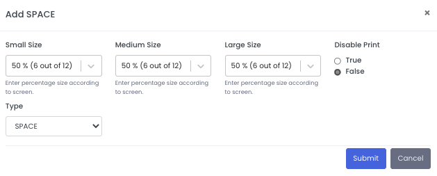
SPACE
To make fields alignment better,emtpy space can be used.
Propertites:
- Small Size: Size of that field in Screen of screen size less than 768px
- Medium Size: Size of that field in Screen of screen size less than 997px and greater than or equal to 768px.
- Large Size: Size of that field in Screen of screen size greater than or equal to 997px.
- Disable Print: Can be True or False, Avoid this field from printing.
TEXT
It provides input field for text.
Propertites:
All Common Properties.
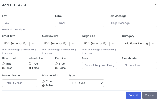
TEXT AREA
It provides input field for long text.
Propertites:
All Common Properties.
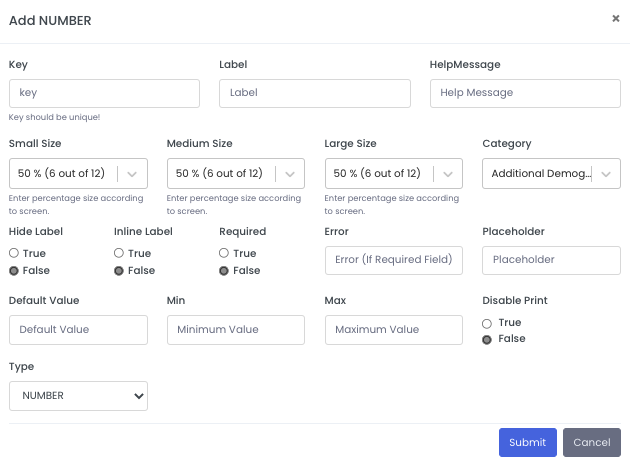
NUMBER
It provides input field for number.
Propertites:
All Common Properties.
- Min: Minimum valid value.
- Max: Maximum valid value.
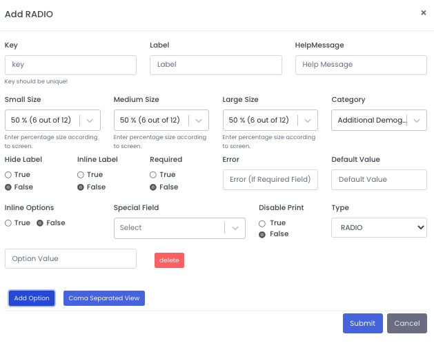
RADIO
A single selection field.
Propertites:
All Common Properties.
- Options: Options can be entered by entering a coma separated string, or by switching to form view and entering option by Add Option Button.
- Special Field:
- IP DEATH CONTROLLER : Boolean, Use to indicated if patient is dead or not.
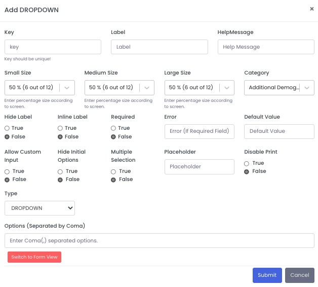
DROPDOWN :
A dropdown field provides dropdown selection from a set of options. It can allow single select or multiple select, and it can have custom inputs, if configured.
Propertites:
All Common Properties.
- Options: Options can be entered by entering a coma separated string, or by switching to form view and entering option by Add Option Button.
- Allow Custom Input: Can be True or False, Allow user to enter custom inputs if true.
- Hide Initial Options: Can be True or False, If True, It will only show options, when user enter something to search else no options will be shown.
- Multiple Selection: Can be True or False, Allow multiple selections if true.
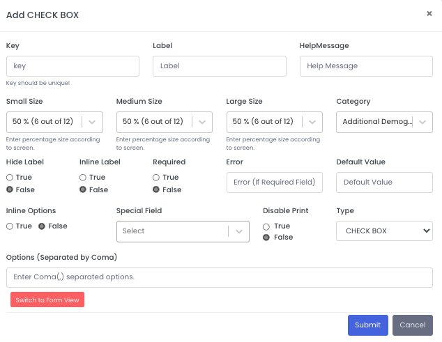
CHECK BOX
A checkbox allow user to select multiple values from a set of options.
Propertites:
All Common Properties.
- Options: Options can be entered by entering a coma separated string, or by switching to form view and entering option by Add Option Button.
- Inline Options: Can be True or False, if True, Options will be aligned horizontally else vertically.
- Special Field:
- IP DEATH CONTROLLER : Boolean, Use to indicated if patient is dead or not.
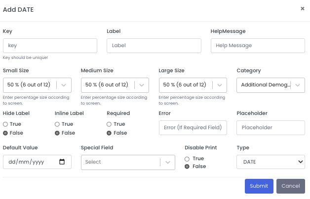
DATE
A Date field allow user to select date.
Propertites:
All Common Properties.
- Special Field:
- IP DATE OF ADMISSION: If selected, then this date will be treated as the date of admission.
- IP DATE OF DISCHARGE: if selected, then this date will be treated as the date of discharge.
- IP DEATH DATE: if selected, than this date will be treated as the date of death of the patient.
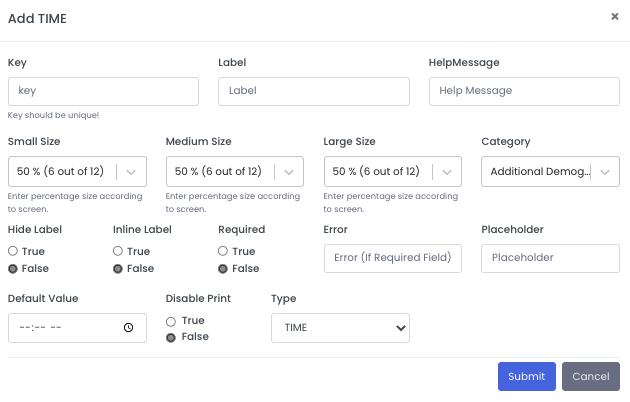
TIME
A Date field allow user to select time.
Propertites:
All Common Properties.
DIVIDER
A horizontal separator line.
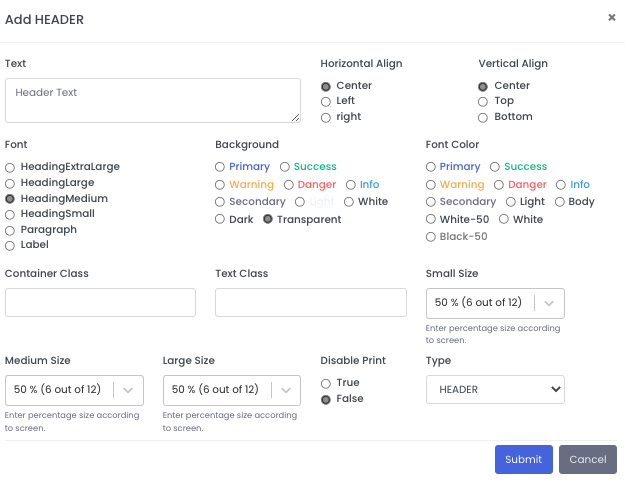
HEADER
A Header is a Text field, which can be used as Heading or Paragraph.
Propertites:
- Text: Text that will be show in this field.
- Horizontal Align: It helps in alignment of text horizontally. It can be center, left or right.
- Vertical Align: It helps in alignment of text vertically. It can be center, top or bottom.
- Font: Select font size, from a set of options.
- Background: Select background color for the header from the given options.
- Font Color: Select font color for the text in the header form the given options.
- Small Size: Size of that field in Screen of screen size less than 768px
- Medium Size: Size of that field in Screen of screen size less than 997px and greater than or equal to 768px.
- Large Size: Size of that field in Screen of screen size greater than or equal to 997px.
- Disable Print: Can be True or False, Avoid this field from printing.
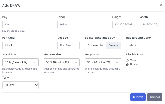
DRAW
This field provides a space to draw,it is generally used for signature purpose.
Propertites:
- Height: Height of draw board in pixels
- Width: Width of draw board in pixels.
- Key: Unique identifier of that particular field.
- Label: A label for the input box.
- Small Size: Size of that field in Screen of screen size less than 768px
- Medium Size: Size of that field in Screen of screen size less than 997px and greater than or equal to 768px.
- Large Size: Size of that field in Screen of screen size greater than or equal to 997px.
- Disable Print: Can be True or False, Avoid this field from printing.
- Dot Size: Size of drawing dot.
- Pen Color: Color of Pen.
- Background Image Url: Can give a valid url of image, which will be show in the background of draw field.
- Background Color: Background color of the draw field.
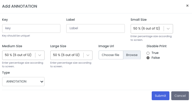
ANNOTATION
Annotation field is used when we need some notes on sections of an image.
Propertites:
- Image Url: Upload Image on which annotations are needed.
- Key: Unique identifier of that particular field.
- Label: A label for the input box.
- Small Size: Size of that field in Screen of screen size less than 768px
- Medium Size: Size of that field in Screen of screen size less than 997px and greater than or equal to 768px.
- Large Size: Size of that field in Screen of screen size greater than or equal to 997px.
- Disable Print: Can be True or False, Avoid this field from printing.
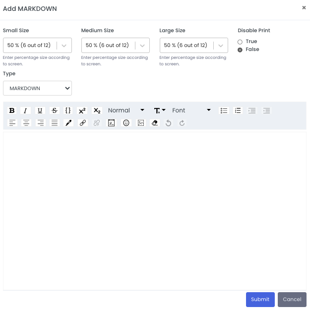
MARKDOWN
Provide rich text in the form.
Propertites:
- Small Size: Size of that field in Screen of screen size less than 768px
- Medium Size: Size of that field in Screen of screen size less than 997px and greater than or equal to 768px.
- Large Size: Size of that field in Screen of screen size greater than or equal to 997px.
- Disable Print: Can be True or False, Avoid this field from printing.
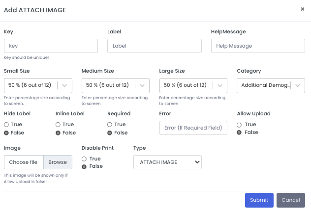
ATTACH IMAGE
This field can be used as Image Input field or to insert Image in a form.
Propertites:
All Common Properties.
- Allow Upload: Can be True or False, If True this field would be used as Image Input Field.
- Image: Required when Allow Upload is False, This image will be shown in form.
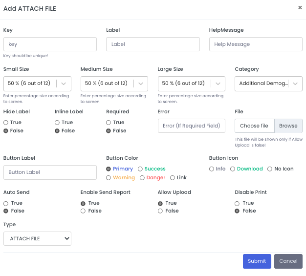
ATTACH FILE
This field can be used as File Input field or to insert File in a form.
Propertites:
All Common Properties.
- Allow Upload: Can be True or False, If True this field would be used as Image Input Field.
- File: Required when Allow Upload is False, This image will be shown in form.
- Button Label: Label of button, that will be shown when file is attached.
- Button Color: Color of button, that will be shown when file is attached.
- Button Icon: Icon of button, that will be shown when file is attached.
- Enable Send Report: If enable, it will ask your to send report to the patient.
- Auto Send: If true, report will be sent automatically.
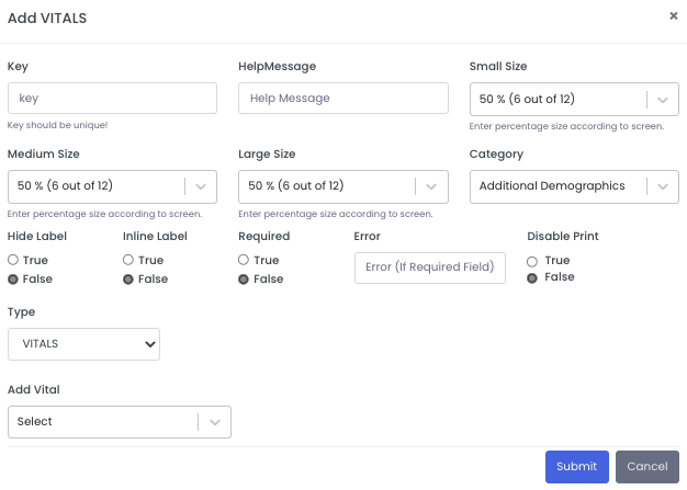
VITALS
These are special fields, to take patient vitals.
Propertites:
All Common Properties expect label.
- Add Vital: Add Vital from the given vitals list.
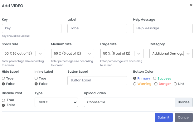
VIDEO
This field is used to attach a video in the form.
Propertites:
All Common Properties.
- Upload Video: Upload video that is needed to attach.
- Button Label: Label of button, that will be shown when file is attached.
- Button Color: Color of button, that will be shown when file is attached.
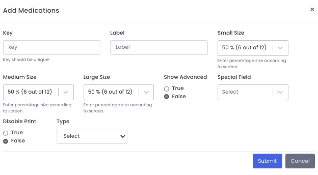
Medications
Medicine selector field.
Propertites:
Key: Unique identifier of that particular field.
Label: A label for the input box.
Small Size: Size of that field in Screen of screen size less than 768px
Medium Size: Size of that field in Screen of screen size less than 997px and greater than or equal to 768px.
Large Size: Size of that field in Screen of screen size greater than or equal to 997px.
Show Advanced: If true it will show advance menu.
Disable Print: Can be True or False, Avoid this field from printing.
Special Field:
IP Medications: Only applicable in IP dashboard, If selected, It will get auto populated in with IP medicines.